
The Reigning Colour Over 2020
Colour experts, Pantone, hold an immense influence over various industries, which makes naming the colour of the year an important trend forecast.
Appearing in diverse areas such as the beauty industry, art market, automotive manufacturing and tech, it seems like Pantone made the right choice in naming the colour of 2020 Classic Blue.
Attentive to distinguish 2020’s colour from Deep Navy, a Bright Ultramarine, or past Pantone colours of the years such as Turquoise, Blue Iris and Cerulean.
Emotions Behind Colours
Eiseman, Executive Director Of The Pantone Colour Institute, explains “When we look at the world around us, we know that we’re living with a lot of unrest, where some days we don’t feel quite as secure, blue, from an emotional, psychological standpoint, has always represented a certain amount of calm and dependability. It’s a colour that you can rely on.”
And we agree, with blue having a long association with peace and evoking a feeling of reliability.
How This Impacts Interior Design.
Blue unites classic designs and is perfectly aligned with interior design’s continuous return to traditional decorating styles. This is where our beloved mid-century design replicas can complement the colour of the year. Timeless designs paired with the classic colour can create a well-devised home.
Our Response
Carefully curated at Pash Classics by our new member to the team, Lydia who’s an in-house interior designer, to show what works with the beautiful, deep colour. She suggests that “Working with subtle tones of white, pink and daffodil yellow effortlessly complements the depth in the colour. Classic blue is an immersing colour so paired with these subtle hues it creates a well-balanced mix.”
Or if you want to make a statement “Contrasting reds, oranges and tan browns can create a different emotion paired with the Classic Blue. It feels daring and bold, suitable for some peoples individual style, but not all.”
Designs such as Jacobsen’s Egg Chair, Eames DSW Eiffel Chair, Knoll Sofas and more can make a flawless pairing.
Our Blue Cashmere, Arne Jacobsen Egg Chair Replica is in keeping with the chosen colour of the year. An accent, rich tone that paired with the minimalist shape and sophisticated high winged back of the Egg Chair, could create a chic centre-piece for your home.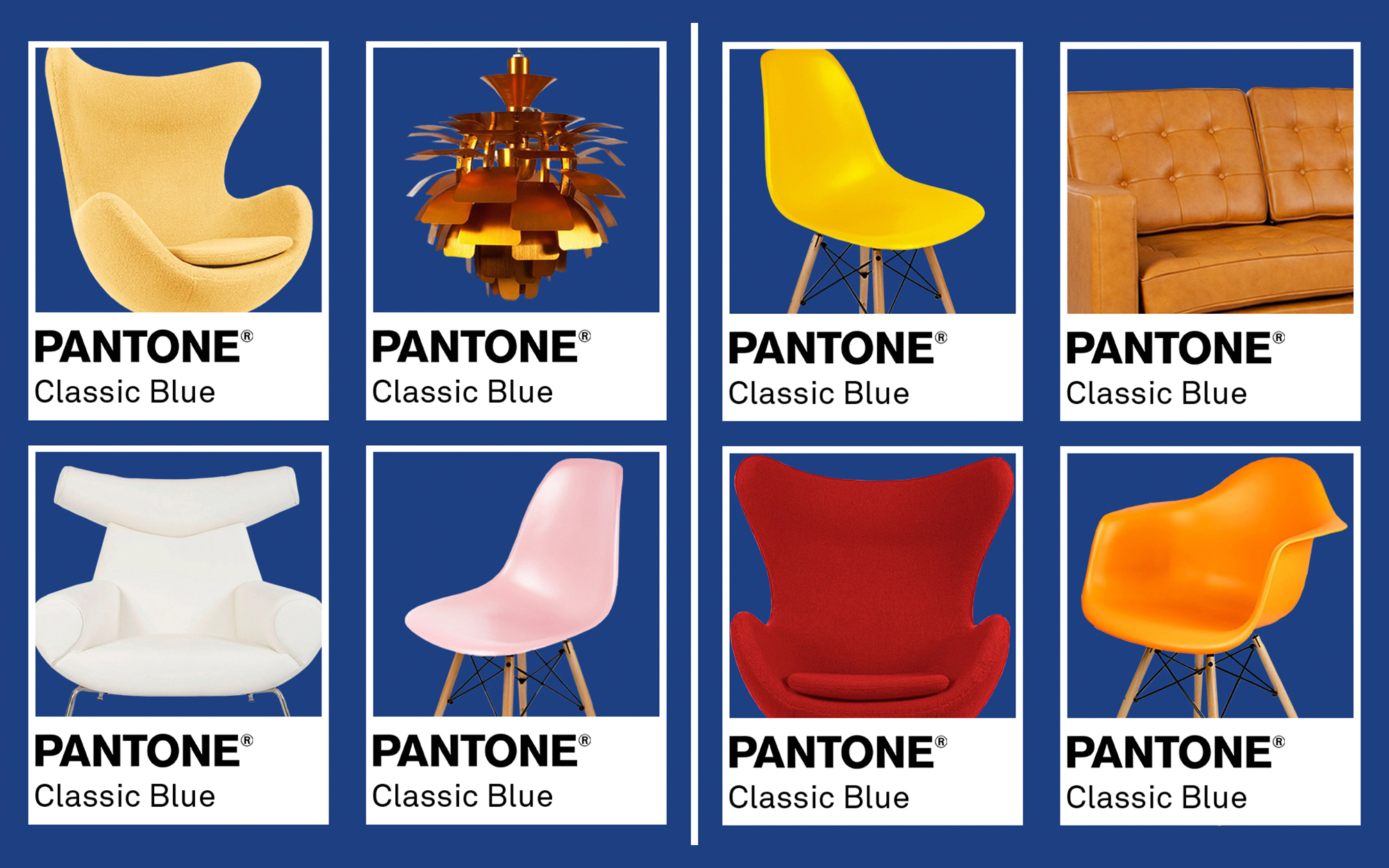
Rethinking The Conventional Idea Of Colour
Along with the naming of the 2020 colour of the year, Pantone proposed a new marketing technique where they collaborated with several brands to produce the senses of Classic Blue, including smell, sound, taste and texture.
The result was a swatch of suede-like fabric, a musk-and-sea-salt-scented candle, a blue, berry-flavoured jelly, and a three-minute audio track titled “Vivid Nostalgia.”
Eiseman’s aspiration is that the exercise will inspire designers and consumers to rethink the idea of colour in the decade ahead.
Our team worked together to come up with our own 5 senses for the colour of the year. The results were a soft cashmere swatch, luxurious and comforting relating to the emotions that the colour evokes. A beach, sea salt scent similar to the one devised by Pantone, the deep blue colour couldn’t get us away from the idea of the sea. A warm blueberry pie, bringing the idea back to comfort, and finally the track Spectra by Oh Lascar. If you had to reimagine colour, what would you think of?
Classic Blue Isn’t The Only Colour Trend To Focus On
Uninspired by the 2020 Classic Blue colour? Pantone isn’t the only one with an impact on interior trends, paint specialists and top international design experts gather at Dulux’s Global Aesthetic Centre to discuss worldwide trends that will affect the upcoming year. The outcome, Dulux develop their own colour of the year by transforming these insights into one essential colour trend.
For 2020, they decided with the start of the new decade and it being seen as a fresh start, that this could be looked upon as a new dawn. The colour experts created an inspiring new shade, Tranquil Dawn.
Influenced by colours of the morning sky, Tranquil Dawn falls somewhere between blue, green and grey. The colour has been described to adapt according to the shades and tones it’s paired with. Dulux released different interior colour palettes to evoke different feelings.
With a common opinion to Pantone, that individuals lives are continually becoming more hectic and digital, there is a common hope among people for compassion and contentment. The colour Tranquil Dawn is believed to convey an emotion of peace which seems to be desired in this day and age.
How Tranquil Dawn Has Inspired Us?
Lydia, our interior designer, has been working on endless cohesive pairings with the versatile colour. “The subtle tone works effortlessly with light woods such as beech and walnut. You can produce an urban aspect to the shade through the use of brighter colours such as blue, mustard and red. Overall Tranquil Dawn, seems to work well with a wide range of different hues making it an easy colour to work within your home”.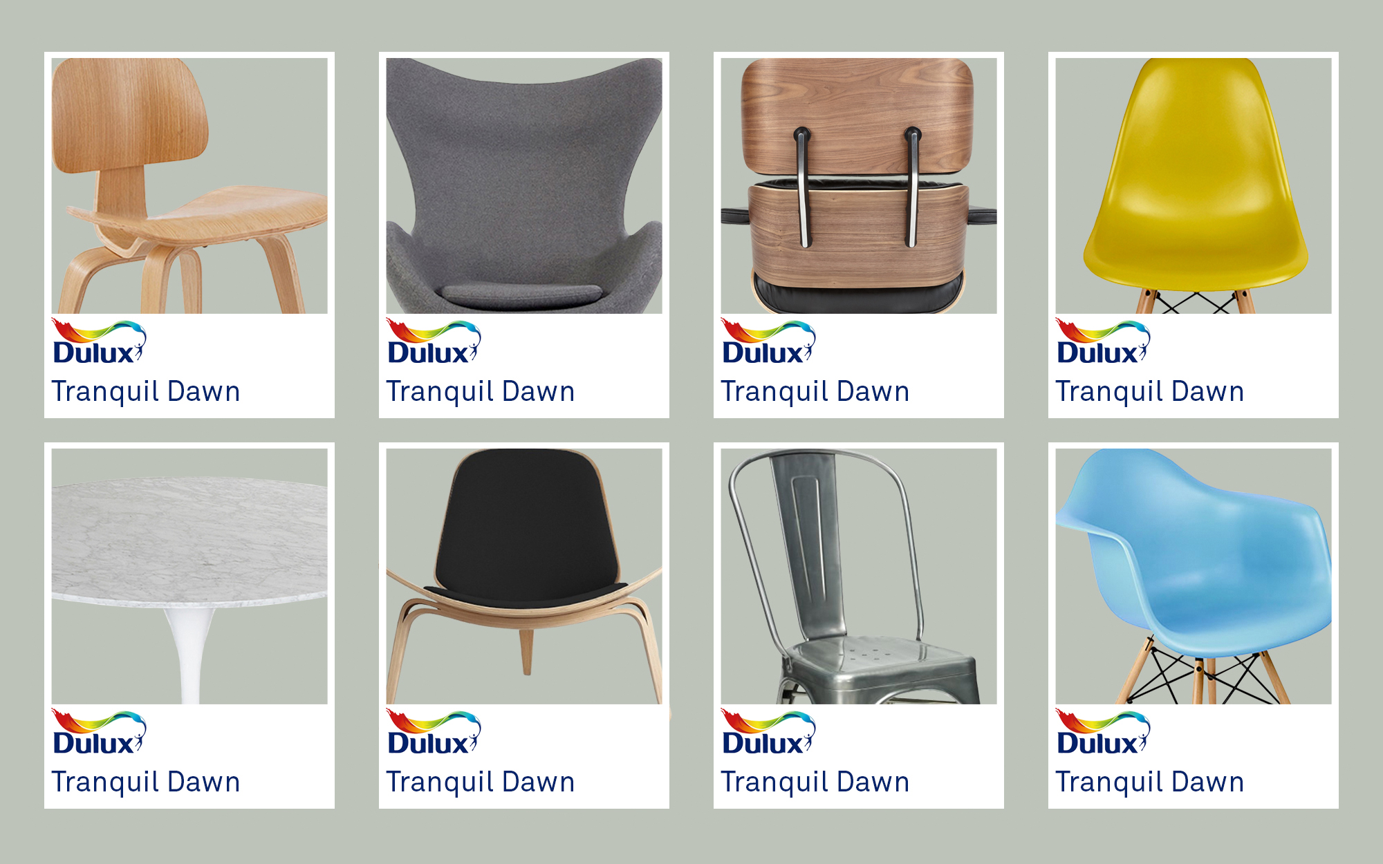
What You Can Take Away
Trends come and go and aren’t always individuals style preference. However, one thing to take away from these upcoming trends is the need to have a place to feel relaxed and at peace, make your home somewhere you can get away from a forever rising, hectic lifestyle. You can reflect your interior on what you need in your life by using colours that bring emotion, rather than just following the trends.