

We are living in a time where change and transformation are predominant, the reason why the chosen 2022 pantone colour of the year is PANTONE 17-3938 Very Peri. Being a powerful symbol of worldwide change and transition, it is an interior design colour that emanates confidence and a daring curiosity.
In this article, we will give you the background of the Pantone colour of the year 2022, its main features, and how you can incorporate it into your home’s modern interior design.
The Pantone Colour Of The Year 2022 Background
Back in 2000, The Pantone Colour Institute started the creative trend of Pantone Colour Of The Year, and since then, it’s released a new colour each year that sets high creative standards in many areas, starting from interior design trends, home furnishing, marketing campaigns, product packaging, fashion, social media, and more.
Going back to 2021, the Ultimate Gray and Illuminating Vibrant Yellow were in power as symbols of support, optimism in the face of adversity, and strength. Now, 2022’s new Pantone colour welcomed us into the new year with a brand new message that animates our creative spirit and helps us to embrace new possibilities. See what Leatrice Eiseman, the Executive Director of The Pantone Colour Institute, has to say:
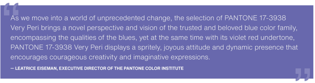
Since the beginning of the year, we’ve seen rapid growth in interior designers’ willingness to open up to new visions as they rewrite home trends, while customers worldwide rekindled an attitude of gratitude, which are all qualities of this year’s colour.
What Is The Pantone Colour Of The Year For 2022: Explained
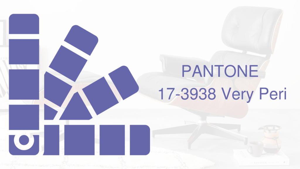
The Pantone colour of the year 2022 is a brand new shade of periwinkle blue, created by combining different shades of serene blue with the lively energy of reds and purples that create a warm and happy shade.
Overall, it boasts joy and shines a light on the future while encouraging us to stretch the limits of interior design by exploring new textures, colour combinations, and the fusion of modern design with personal inventiveness and creativity.
At Pash Classics, we believe that as we move into a world of uncertainty, having the Pantone 2022 colour of the year as Very Peri brings a vision of the much-trusted family of blue colour, beloved by designers and shoppers alike. While it’s imperative to stay true to your own interior style, there are endless possibilities to bring this year’s special shade into your home.
Pantone Colour Of The Year 2022 Interior Design Inspiration
Now that we know a little bit more about this year’s revolutionary colour, it’s fair to ask the bigger question: what does interior decor’s future look like?
Lately, we’ve seen a refreshing sense of playfulness in people’s homes, starting with the experimentation of unusual colour combinations to the introduction of a boldly-hued statement piece as the star of the show. There is no denying that in the past two years, people have searched for new ways to learn how to be happier at home while adjusting to the refined idea of working from home, so many people found comfort in revamping their interior decor and style, as they still do nowadays. Very Peri is highly suitable for a wide array of different materials, textures, and finishes while adding a pop of colour when incorporated through a painted wall, accent furniture, or piece of decor.
We believe this trendy colour can easily act as an intriguing and eye-catching accent in a well-created pattern; therefore, we’ve put together 4 different colour palettes that convey different moods you can adopt. To help you think like a professional interior designer, look at our PANTONE 17-3938 Very Peri combinations below.
The Star Of The Show Colour Pallete
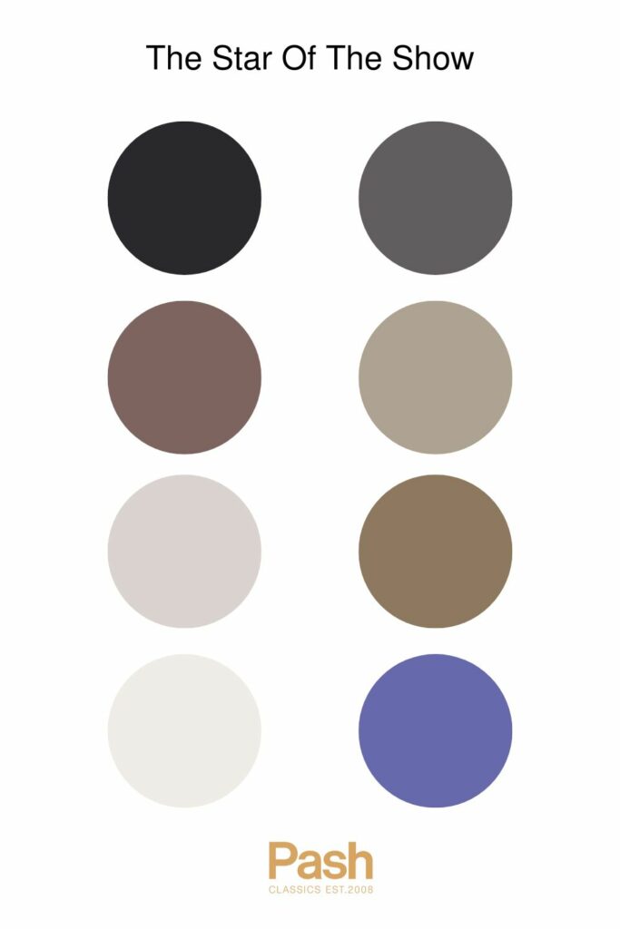
The Star Of The Show is our favourite colour palette, as it emphasises the dynamic presence of Pantone 17-3938 Very Peri and boasts a happy aesthetic and warmth. It’s s a harmonious combination of all various blue hues with a chic palette of classics and neutrals that emanate elegance and timeless sophistication.
Balancing Act Colour Pallete
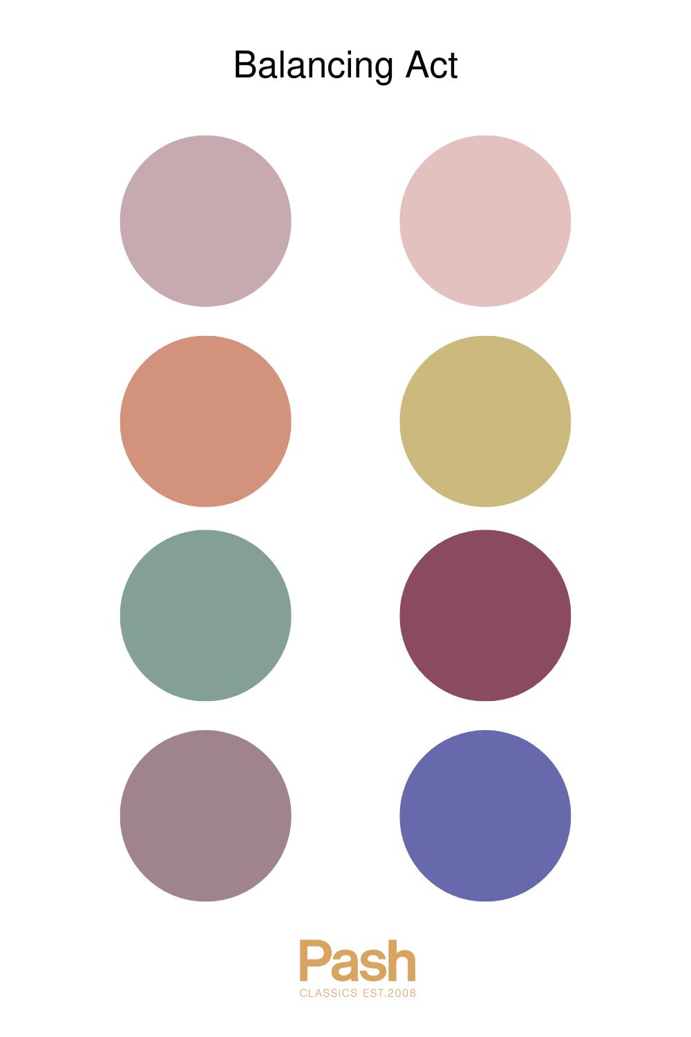
Balancing Act is a beautiful complementary colour palette, defined by the natural balance of warm and cool tones supporting and enhancing each other. What’s more, the liveliness and vibrance of the Very Peri tone are visibly intensified due to the artfully calibrated combination of colours.
Amusements Colour Palette
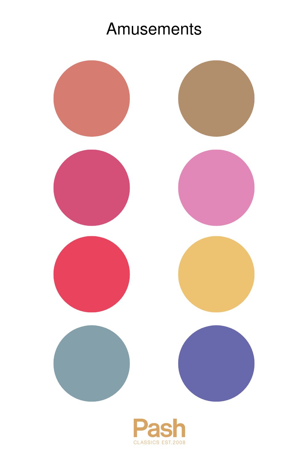
Amusements, a very optimistic and playful colour palette, boasts a story filled with fun and spontaneity, amplified by the Very Peri’s carefree and confident attitude. For interior design lovers, the sparkling blue hue will inspire joyful boldness when creating their dream home interiors while embracing personal inventiveness and self-expression.
Wellspring Colour Palette
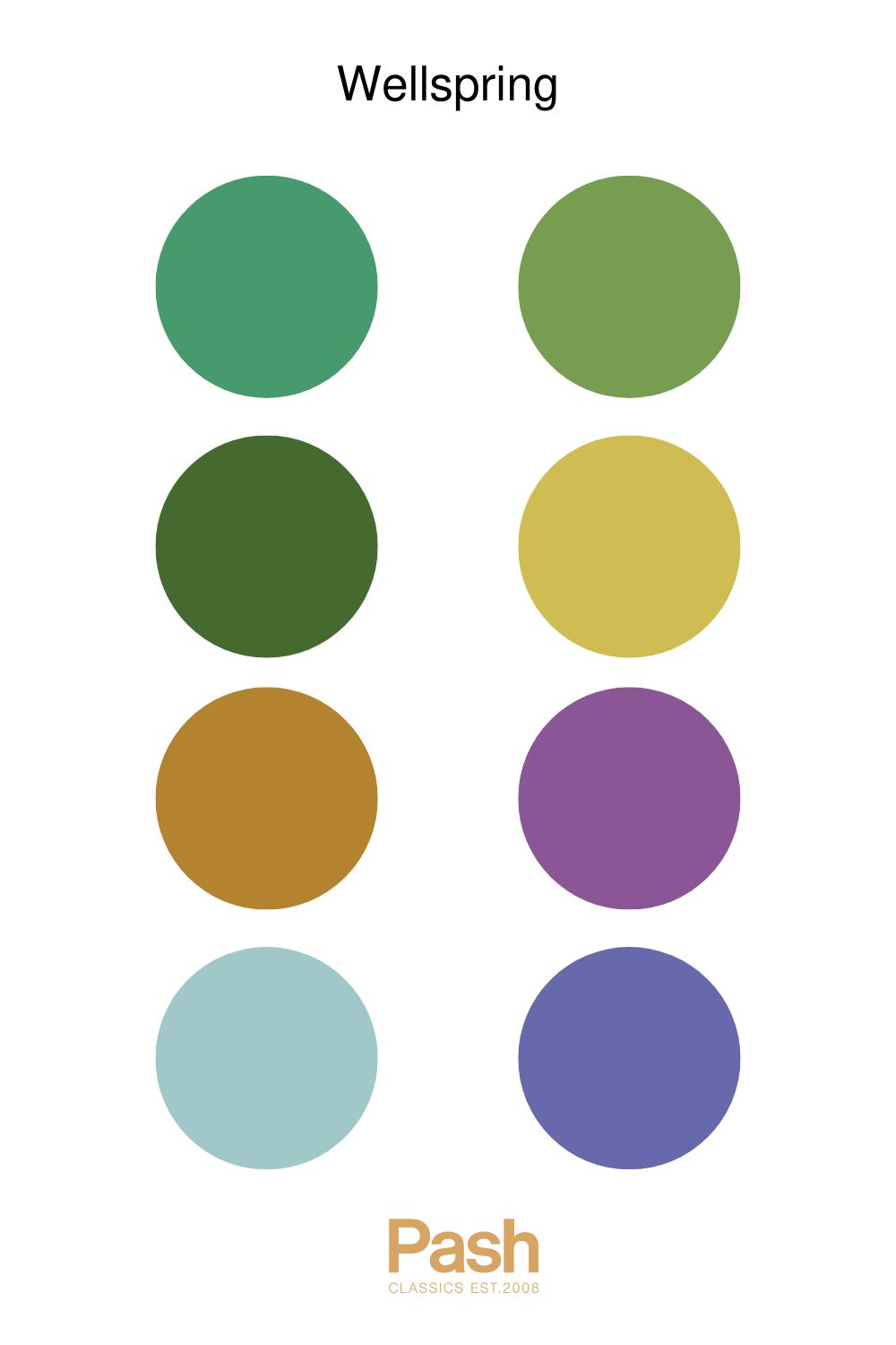
And to close it off with a more holistic and harmonious colour palette blend, the Wellspring brings the nature-infused shades into your space. It highlights the compatibility of the greens with the adored Very Peri, thus creating a very subtle and nourishing combination for everyone to enjoy.
Final Thoughts
Moving forward, it is clear that in the world of interior design and home decor, the Pantone colour of the year 2022 will continue to infuse a sense of playful freshness and invite the idea of “unusual” combinations in terms of colours, textures, and furniture design.
We recommend you embrace this lovely violet-infused blue tone into your life and home and appreciate its beauty that is already present in nature, in the form of vivid plumage and graceful lavender flowers. Additionally, it will continue to shake up and revolutionise the interior design world by allowing room for exploring many lively colour combinations.
It is exciting to see interior designers achieving their desired moods while showing us that the integration of Very Peri into colour palettes is very smooth and straightforward. And this leaves us with one conclusion – we hope you’ll enjoy and have fun integrating this year’s Pantone colour harmoniously in any way you wish. For more inspiration and interior design tips, check out our blog on How To Create A Complementary Interior Colour Scheme and How To Spend Time Uplifting Your Home.