

Making a decision for your home’s interior colour scheme can feel daunting, but it doesn’t have to be! For an interior that looks professionally done and complements both you and your home, you want your colour scheme to be coherent. Every room doesn’t have to be the same, but you want to create consistency and a natural flow.
For example, if you coordinate your home too much, it can feel cold and plain, and if you don’t coordinate enough, it can feel overwhelming and distasteful. In reality, there is no right or wrong answer, but this blog post will help you find what’s right for you and your sweet home by offering our top 6 steps on how to create a complementary colour scheme in interior design.
Step 1: Find Your Colour Inspiration
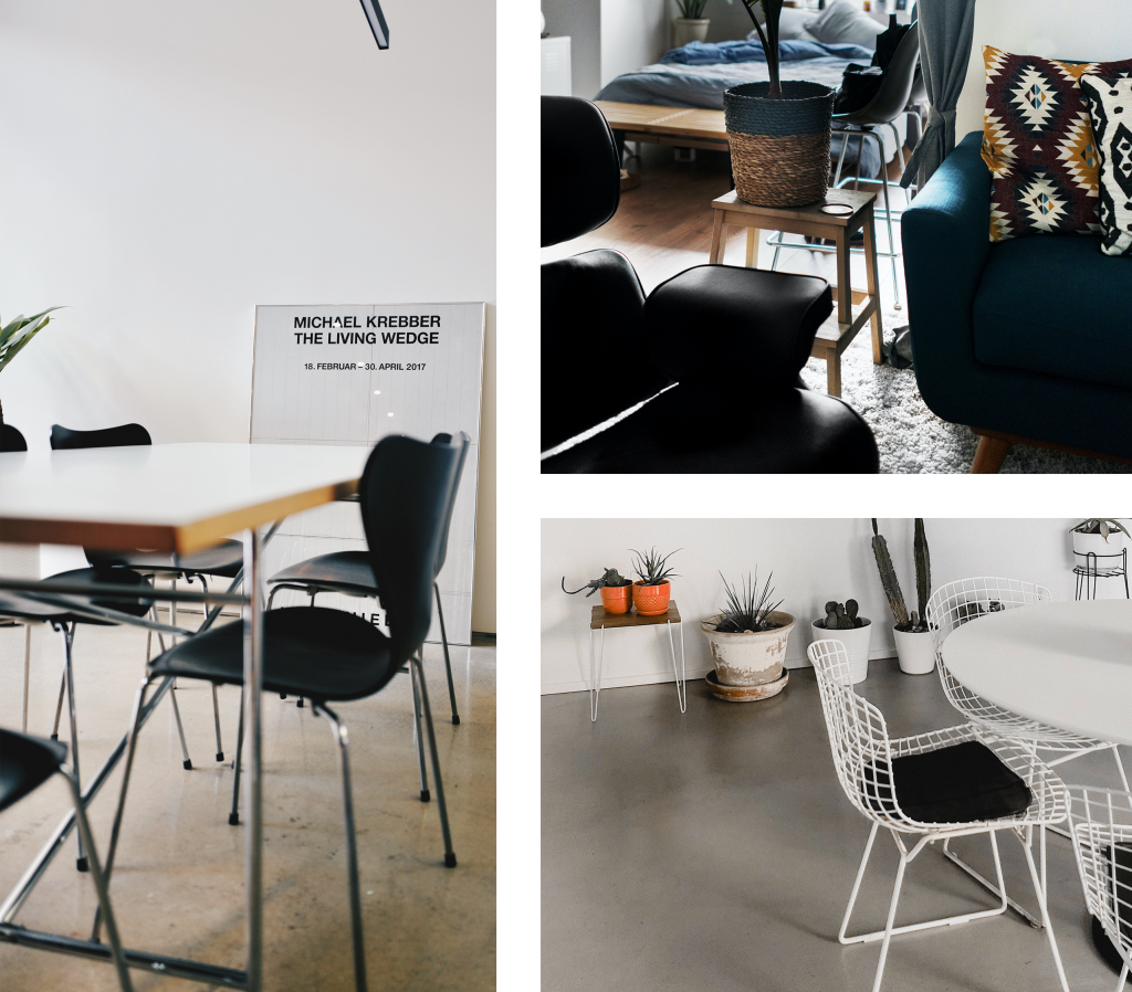
Creating a mood or inspiration board can help you find the most appropriate direction.
Everyone has different opinions on how they want their home to look, so a Pinterest board with all your ideas for interiors, furniture, colours, and accessories can help you to decide what is for you. You can find inspiration online, in magazines, in fashion, artwork or nature!
Step 2: Analyse Your Moodboard For Your Interior Colour Scheme
The main rule when creating complementary colour schemes is to always look at what images or pieces have inspired you.
- What has drawn you to them?
- How do you want them to inspire your interior?
- What colours are there, and how do they make you feel?
By analysing your mood board, you can gain a much better understanding of what you like and what you want to recreate. For example, are there one or two colours that keep reappearing?
Understanding your emotional connection to a certain colour can help you decide whether it is right for you to use in your home. After all, did you know that your home interior design can be impacting your well-being?
Colour Psychology
Colours evoke different feelings for different people, but understanding various colours can help you make the right decisions.
For example, black can represent a sad and overpowering colour with its depth of darkness, whereas others may enjoy the powerful and dramatic feeling it can portray.
Warm Colours
These colours usually include a red, orange, or yellow undertone. Bolder warm colours normally bring energy to a space, so they aren’t recommended to use in large quantities in rooms that are designed for relaxation. Usually, we find warm colours more homely due to the comforting feeling they provide.
Cool Colours
Colours classed as cool usually include a blue, green, or purple undertone. This category of colour is usually more calming due to its close connection with nature. These colours are recommended for a room that’s meant for relaxation. However, some people may not like a colour scheme featuring cool colours as it can feel too cold and bleak.
Your environment can greatly influence your emotions and feelings, so making the right decision is important!
Step 4: Look At Your Home’s Fixed Elements
By fixed elements, we don’t mean parts you can’t change in your home, as everything can be updated, but these elements will be costly to change, such as flooring, kitchen cupboards, etc.
Decide whether they have a warm or cold undertone, and if you don’t want the cost of renovation, then it would be best to go for a colour scheme that matches the category of undertone that these fixed elements complement.
Step 5: Choose The Type Of Colour Scheme
By this point, you should’ve decided whether you’re going down a warm or cold route by looking at your inspiration and your fixed elements.
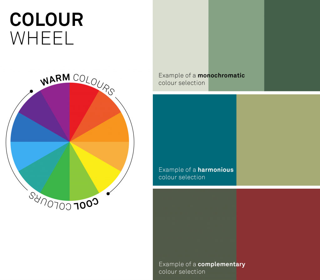
There are 3 types of complementary colour schemes from which you can choose:
- Monochromatic – where you take one colour to apply it to a couple of different nuances
- Harmonious – where you pick two colours next to each other on the colour wheel
- Complementary – when you choose two colours that sit opposite each other on the colour wheel
Once you’ve decided which route to take, add one white and one neutral colour to your colour palette, but remember to always make sure these suit your fixed elements.
Step 6: Stop Or Add More Colours
After deciding on your interior colour scheme, you can take it further by adding more colours through your home accessories and statement chairs or just leave it to those already chosen.
Pantone Colour Of The Year 2021

After 22 years of selecting the colour of the year, colour experts Pantone have chosen 2 colours to represent the year 2021. This happened only once, back in 2016, when Rose Quartz and Serenity were paired.
The two colours are Ultimate Grey and Illuminating, a bright and cheerful yellow. They’ve been paired together to fortify the year with energy, clarity, and hope. In a world facing a lot of uncertainty, this is a perfect statement for the year ahead.
These “two independent colours highlight how different elements come together to express a message of strength and hopefulness that is both enduring and uplifting” – Leatrice Eisman, Executive Director of the Pantone Colour Institute.
This illuminating shade evoked an optimistic feeling, promising better days ahead in 2021. Ultimate Grey is a quieter hue that helps to resemble the calm composure, steadiness, and resilience that many people worldwide were feeling at that time.
Dulux Colour Of The Year
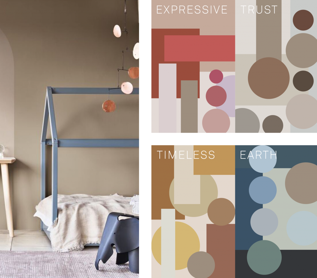
Dulux has understood the change that 2020 has caused in everyone’s lives. The paint expert’s colour of the year is called Brave Ground.
It is a warm and earthy tone that is said to create a feeling of stability, growth, and potential, emotions which everyone was looking to feel in the upcoming year 2022. Essentially, it is a bolstering shade that helps to create a connection back to nature and the simpler things in life.
Final Thoughts
It is great to understand the power of colours, as they can have such an important impact in and on our lives.
Choosing the right complementary colour scheme in interior design will greatly affect how you feel in your home. At the end of the day, we’re all on the hunt for ways how to be happier at home and in life generally, so why not start with this small step?
If you’d like to get more inspiration and tips, read our articles on: